So, to put my money where my mouth is, I’ve finally starting to approach Silverlight from a Flex perspective.
Personally, I develop in both .NET and Flex/AIR. Last year, I saw this example by Robby Ingebretsen and decided that there was more to Silverlight than meets the eye.
Part One: Basic Layout in Blend 3
I’ve decided to start this series with layout and components. Now, I’m making a few guesses and assumptions as I go, so I encourage anyone who notices discrepancies to comment away.
First off, Download Expression Blend 3 Preview. It’s free until September 09, so go get it. (Blend is actually a WPF application).
Second, create a new Silverlight application.
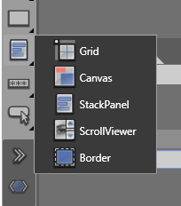
Now, having a look inside Blend take a gander at the Layout containers:

Layout Containers
- Grid – interesting component, seemingly very well used, not really comparable to Flex Grid as it is composed of invisible rows and columns and allows customisable anchoring and scaling within each cell.
- Canvas – this is like the Canvas in Flex, an absolutely positioned layout container.
- StackPanel – think Box. It’s the same idea. Layout by stacking children either vertically or horizontally.
- ScrollViewer – Scrolling is not something inherit to all containers like it is in Flex 3. It is something you add to a layout component if you choose. Flex 4 (Gumbo) seems to be going this way as well.
- Border – As with scrolling, bordering isn’t native to containers. It needs to be added in also.
Collapsed Visibility
Something to note here too is collapsed visibility. A nice feature of XAML that Flex has yet to implement . Say you have a Flex VBox with 3 buttons and you wanna remove a button, you’d use either a ViewStack or a State, right? (or maybe actionscript if you were keen) – in Silverlight, you can set visibility to Collapse to achieve the same thing.
Anchoring & Margins
Essentially, components can either use a margin to determine how wide and high they are or use alignment + width and height. The latter must be placed in a Grid/ScrollViewer/Border and then using both the width/height and the HorizontalAlignment and VericalAlignment tools to lay them out.
If you opt for the Canvas container instead, you then use the typical top, left and z-index to layout the items.
Attached Backgrounds
Another nice feature is how the background can be easily customised. For example, try out the Gradient tool and apply it to any container (or component for that matter – like shapes, text or buttons).

See the XAML? (switch to Split view). See how applying the Gradient tool to a
- Grid goes under <Grid.Background>
- Button comes under <Button.Background>
- TextBlock comes under <TextBlock.Foreground>
This is similar to accessing the graphics property of any UIComponent in Flex. However, the obvious advantage here is how easy Expression tooling makes applying gradients to any object.


Recent Comments